 10 July 2026
 Share
Share
1
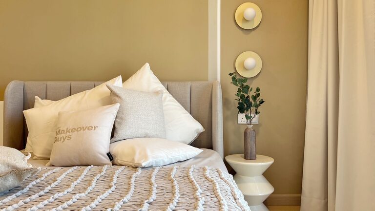
Creating a peaceful atmosphere at home often starts with the colors you choose for your walls and decor. Calm colors can help reduce stress, encourage relaxation, and make your living space feel more welcoming. If you’re thinking about refreshing your home’s look with soothing tones, this guide will help you pick the best calm colors and use them effectively.
Calm colors are typically soft, muted shades that promote tranquility. Unlike bold or bright colors, they don’t overwhelm the senses but instead create balance. Using calm colors can:
– Ease anxiety and promote relaxation
– Make rooms feel spacious and light
– Serve as a flexible backdrop for furniture and decorations
– Enhance natural light, making spaces feel fresh
Now, let’s explore how to confidently select calm colors for your home.
Before choosing colors, think about the purpose of the room and the mood you want to set. For example:
– Bedrooms: Aim for restful colors like soft blues, greens, or gentle neutrals to promote sleep.
– Living Rooms: Choose inviting shades like warm grays, muted taupes, or pastel hues to encourage conversation and comfort.
– Bathrooms: Crisp and clean colors such as pale blues, seafoam green, or light lavenders can create a spa-like feel.
– Home Offices: Calming but focused colors like soft greens or cool grays can help maintain concentration without feeling dull.
Having a clear idea of the mood will guide you toward the right palette.
Neutrals are often the foundation of calm color schemes. Shades of beige, ivory, gray, and soft white set a peaceful tone and pair easily with other colors. Some tips on using neutrals:
– Choose warm neutrals (like creamy beige) for a cozy vibe.
– Go for cool neutrals (like soft gray) for a modern and fresh look.
– Avoid stark whites that can feel cold or clinical; instead, pick warmer whites with a hint of yellow or pink undertones.
Neutrals provide versatility and longevity, so you can update your accent colors without repainting everything.
Pastels are naturally calming because they are light and subdued. Consider adding:
– Soft blues: Remindful of the sky and water, blue tones are soothing and reduce stress.
– Muted greens: Green connects us to nature and is easy on the eyes.
– Light lavenders or lilacs: These add a gentle sense of luxury and calm.
– Pale pinks or peaches: Warm pastels that feel welcoming without being overpowering.
Earth tones such as sandy browns, soft terracotta, and warm greys also create a grounded, serene environment.
Colors can look very different depending on the type and amount of light. To make the best choice:
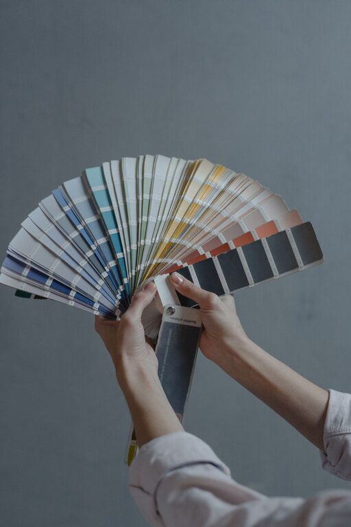
– Test your paint samples on different walls and view them at various times of day.
– Observe how natural sunlight affects the color in the morning, afternoon, and evening.
– Use lamps and overhead lighting to see how the color looks at night.
This practice helps you avoid surprises and ensures your chosen color maintains its calming effect throughout the day.
Even in calm color schemes, contrast adds interest and depth. Here are some ways to balance your colors:
– Pair light walls with slightly darker furnishings or accents to create subtle contrast.
– Use textures like soft fabrics, natural wood, or matte finishes to enhance the visual appeal without bright colors.
– Add small pops of color with accessories like pillows, throws, or artwork to keep the space lively yet calm.
Avoid harsh contrasts like black and white that can feel stark and disrupt the tranquil vibe.
The finish affects both the appearance and feel of your walls:
– Matte and eggshell finishes: These have a soft look that complements calm colors well.
– Satin finish: Offers a gentle sheen and is easy to clean, making it a good choice for living rooms and kitchens.
– Glossy finishes: Usually more vibrant and reflective, so they are less suitable for a calming atmosphere.
Choosing the right paint finish enhances the overall serenity of your room.
For a cohesive and peaceful feel, think about how your colors connect from room to room:
– Use a consistent neutral base throughout the home.
– Add accents or features in varying shades of your main calm color to unify spaces.
– Avoid sudden color shifts between adjacent rooms; opt for harmonious transitions.
This approach makes your home feel thoughtfully put together and calming throughout.
Choosing calm colors for your home is more than picking pretty shades; it’s about creating a space that supports your well-being. By understanding the mood you want, testing colors carefully, and balancing tones thoughtfully, you can transform your rooms into serene retreats. Remember that calm colors don’t have to be boring—they can be warm, inviting, and stylish while encouraging relaxation every day.
Happy decorating!